The ability to deliver actionable, impactful insights for customers has always been a key objective for the Bugcrowd Platform. Our access to millions of data points about vulnerabilities, assets, and hacker skills collected over the past dozen years—and more importantly, the ability to correlate them usefully in a security graph to create value for our customers and hackers alike—directly enables that goal.
As another milestone in that effort, we’re proud to announce that we have made rich, fine-grained insights about customer security programs more consumable than before through an enhanced Insights Dashboard. With this dashboard, Bugcrowd Platform users can get a comprehensive view of program and engagement health, impact, and direction across numerous dimensions (metrics used defined in our docs), including:
- Submissions—Trends and counts for states, state transitions, and severity (per target or VRT category)
- Performance—Mean time needed to detect, triage, review, and resolve
- Researchers/Hackers—Total number and new versus returning
- Spend—Reward amounts (total/highest/lowest/average), dates, severity breakdowns, and remaining pool trends
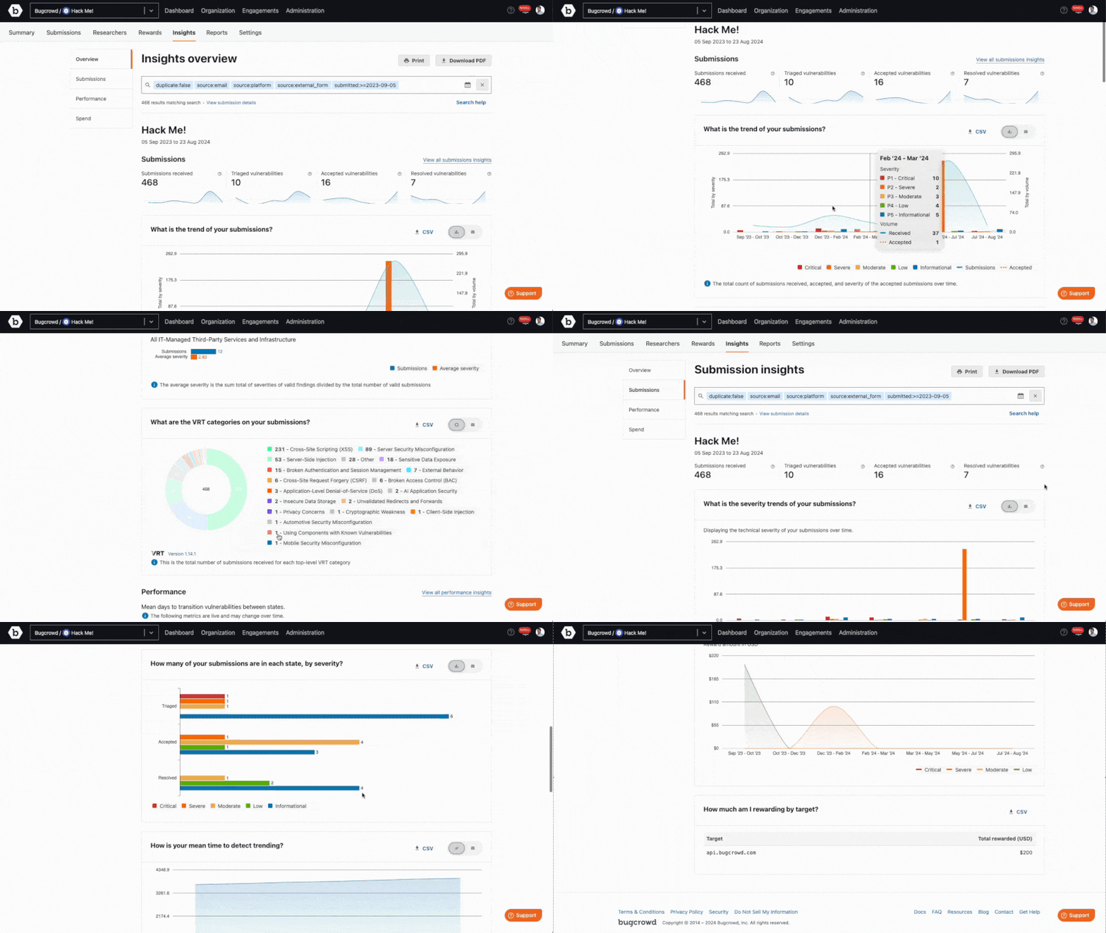
Now, read on to see a few examples of what you can do with the enhanced Insights Dashboard!
Dashboard highlights
First, choose from a rich list of filters to view insights in whatever context is desired. A full what-you-see-is-what-you-get (WYSIWYG) report PDF can be downloaded for whatever criteria are used.
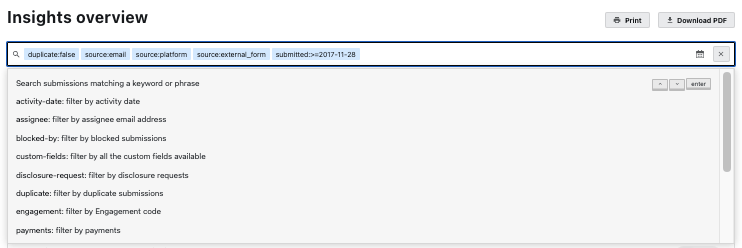
The submissions summary (pictured below) shows state statistics and high-level submission trends.

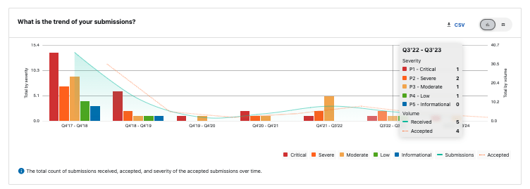
Accepted and received submission volume over time is shown with an overlay of severity by volume. Note that for all reports, data can be toggled between chart and table formats and downloaded in a .csv file. Here’s an example of what that view looks like:
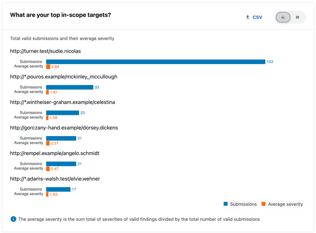
Top in-scope targets shows the targets receiving the most valid findings, as well as the average severity of submissions for each of those targets.
The Vulnerability Rating Taxonomy (VRT) categories report shows the total number of submissions received for each top level VRT category.

The performance section shows a summary about mean days needed to transition vulnerabilities between states.

It also shows how long it takes to transition vulnerabilities, broken down by severity.

The spend section includes an overview of spend across your program and engagements.

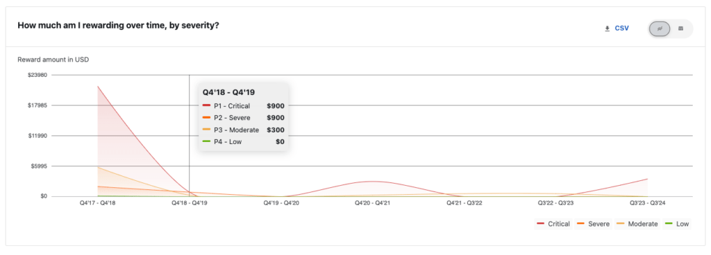
This section includes, among other things, a report of rewards paid to hackers over time by severity.
It also shows the total spend versus how much is remaining in the payout pool over time.

In summary
These updates give customers real-time visibility, with a simple user interface to make reporting on your program’s success as straightforward as possible. Using these insights, we’ll work together to make sure you don’t hit a “program ceiling” that many users of other crowdsourced security platforms experience. With multiple ways to visualize data and metrics on the Bugcrowd Platform, it is easy to monitor your program health, benchmark against key metrics, and make actionable improvements.
If you’re already a Bugcrowd customer, we hope that this post has provided a taste of the capabilities of the new Insights Dashboard (visible when Security Program Management is enabled). If you’d like to take a look at the remaining sections of the dashboard, login to your account and check it out.
If you’re looking to become a Bugcrowd customer, get in touch to book a full demo of the redesigned Insights Dashboard in action!
